SunExpress Airlines
Travel with ease and confidence - Creating the ultimate flight companion for SunExpress
Overview
SunExpress is an airline that operates in several countries, with a focus on holiday travel. They approached our design team to create their first mobile application for both iOS and Android platforms, with the goal of delivering a streamlined yet robust booking process, an effortless check-in and manage booking flow, and maximizing revenue from ancillary product sales.
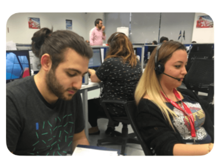
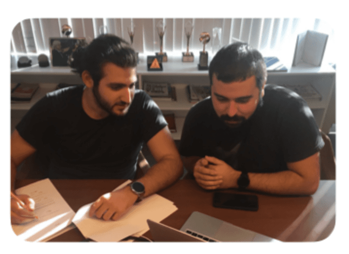
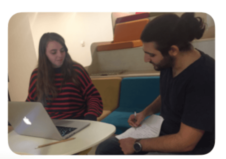
I confidently led the UX design and research efforts of a team of 3 designers. I conducted user research, designed interactions, created information architecture, and laid out the design. I also made significant contributions to the visual design process and prototyping on Invision.
Challenges
As the project was initiated we recognized five key challenges that needed to be addressed: increasing flight bookings, establishing a strong brand-user relationship, boosting ancillary product sales, reducing stress at the airport counter, and encouraging users to check-in through the app.
Key Considerations and Research Process
Throughout the design process for the SunExpress Mobile App, I kept in mind several key considerations, such as clarity, integrity, consistency, inclusiveness, avoiding technical language, and empathizing with the user. These considerations are crucial for creating a user-friendly and effective mobile application. To ensure that the design aligns with these considerations, I spent a significant amount of time conducting user research and competitive analysis by benchmarking the best airlines in the world.
The research process presented a challenge due to time and budget constraints. However, I was able to work around these limitations by starting on the mobile website traffic and demographic information provided by Google Analytics.
This information helped me create four personas based on user journeys and conduct face-to-face interviews with users to understand current problems on the existing website. By understanding user pain points, I was able to design a mobile app that addresses these issues and provides a streamlined and intuitive user experience.
In addition to user research, I benchmarked the 50 best airlines in the world and reviewed every airline application to understand their complete flows and solutions. I focused on how the city and date selection have been provided to users by different airlines, as SunExpress had different route availabilities on different times of the year. This helped me identify best practices and incorporate them into the design of the SunExpress Mobile App.
Identifying User Pain Points and Addressing Them
Based on my research, I identified several key pain points for users, including frustration when entering data, worries over price transparency and fluctuations, struggles to find necessary information, communication issues where the language is industry-specific, and in-app interruptions that are distracting. To address these pain points, the design process focused on addressing user goals, such as booking flights quickly and simply, searching for the cheapest flights, having multiple payment options, the possibility of canceling a booking without paying a lot of fees, and checking in and creating a boarding pass.
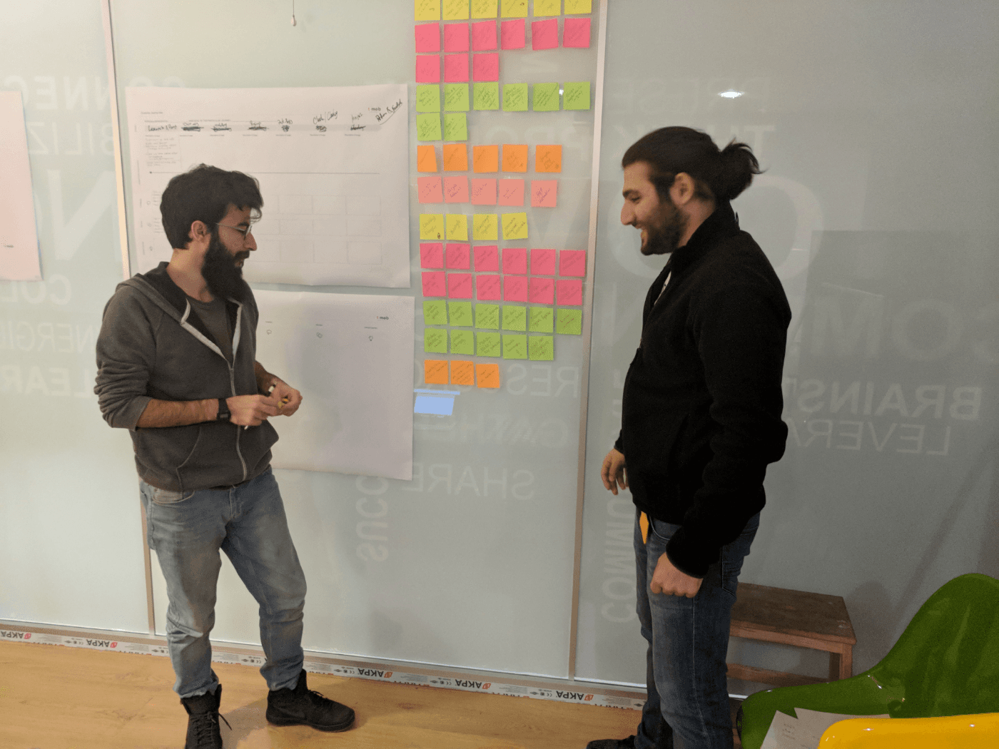
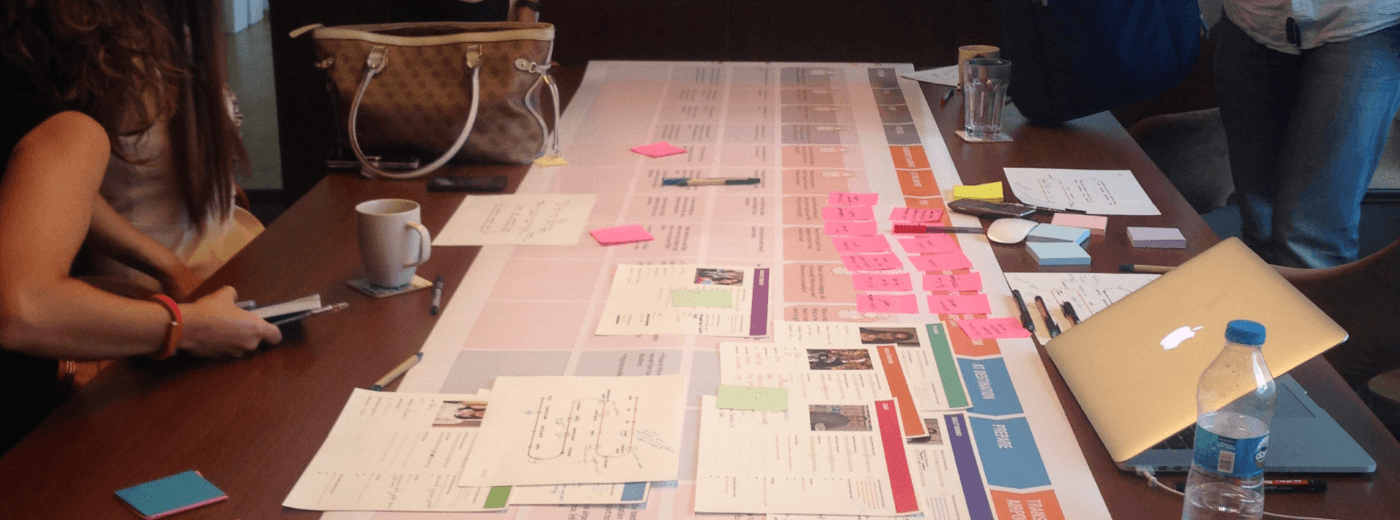
Our team used a collaborative approach to analysis. We began with an affinity diagram to list ideas and outcomes, then looked at usability testing and in-depth interview notes, studied online survey results, reviewed competitive benchmarking findings, and took notes. As we progressed, clear categories emerged. We created a step-by-step view of the user journey, focusing on their goals, context, behaviors, and pain points at each step. Additionally, we created a graph to show the user's emotional curve during their journey.
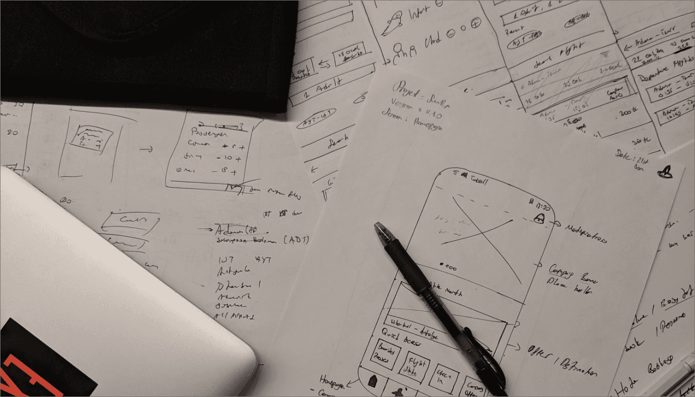
For the SunExpress Mobile App project's UI exploration phase, we started with quick sketches and turned them into high-fidelity wireframes. These were presented to developers, fellow designers, and stakeholders to ideate, understand, and discuss the solutions we created.
Designing the Visual Elements
The visual design part of the project was relatively quick. However, we still took great care to ensure the design would meet all our expectations. In order to achieve this, we designed all the design elements we would use in the interaction design step as components. By doing so, we were able to streamline the design process and ensure consistency throughout the project.
Our main task in the visual design part was to focus on the color scheme, typography, and iconography. We paid close attention to accessibility, comprehensibility, and inclusiveness, ensuring that our design would be adaptable to a wide range of users.
To achieve these goals, we chose to make the brand color orange our primary color. Additionally, we used dark blue in texts as part of the branding, which allowed us to create contrast as well as achieve the desired rhythm. We also wanted to give depth of feeling through the use of shadows and white space, which required careful consideration and attention to detail.
Overall balance was provided with font combinations. We carefully chose fonts that would complement each other and enhance the overall look and feel of the design. Throughout the design process, we paid attention to the use of gestalt by keeping related objects as close as possible. This not only helped to improve the overall user experience but also made the design more visually appealing.
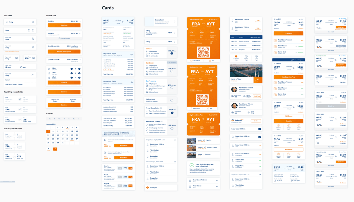
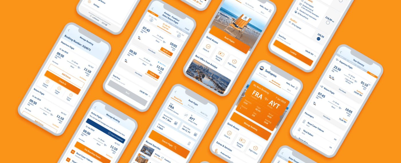
Key Features
We have designed a range of key features specifically for our valued SunExpress passengers. Our team has worked tirelessly to identify and address the unique needs and preferences of our customers, ensuring that we provide an exceptional level of service that exceeds expectations.
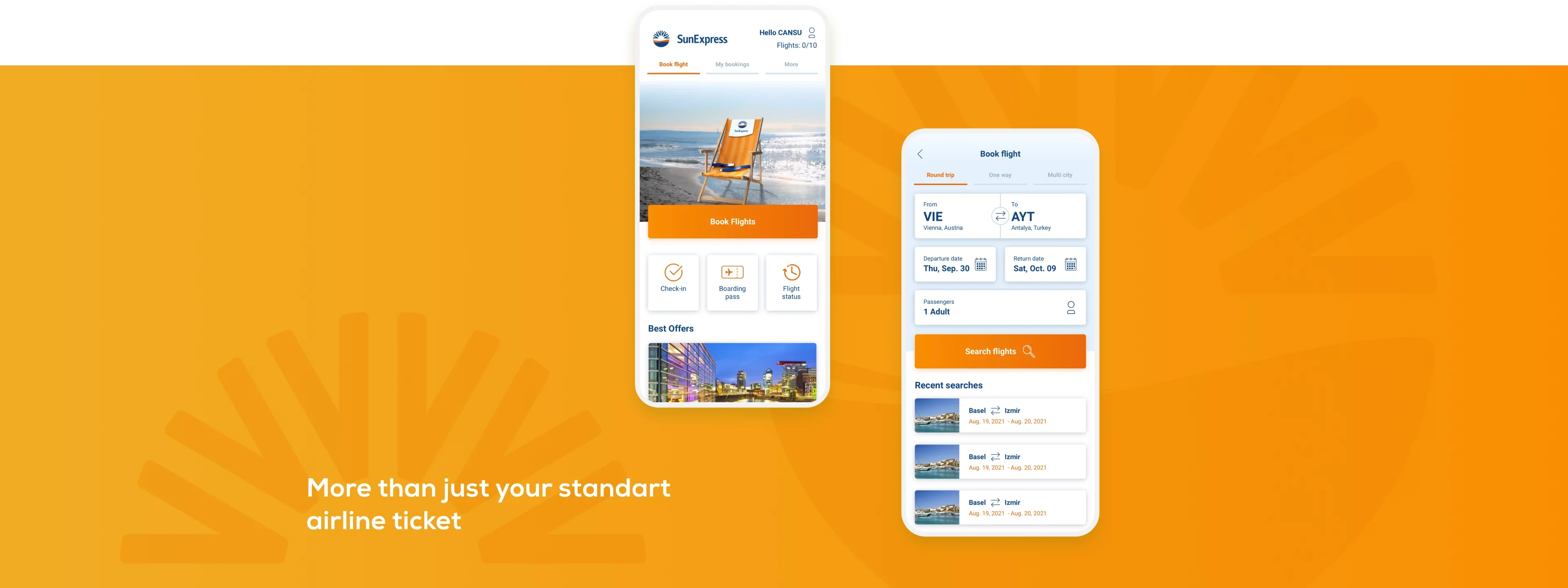
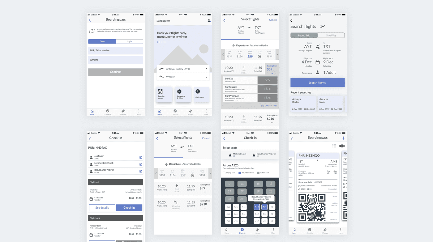
Homepage
The homepage consists of three tabs:
Book Flight
My Bookings
More
On the right, above the three tabs, there is a login CTA. Once the user logs in, the login text changes to the passenger's first name to give a personalized feeling. It also takes them to their profile once logged in.
Both the Book Flight and My Bookings tabs have three quick actions: Check-in, Boarding Pass, and Flight Status.
On the Book Flight tab, below the quick actions, we display Best Offers based on the user's location.
Book Flight
On the Book Flight journey, we have three tabs: Round-trip, One Way, and Multi City. Below that, we have the booking engine, and below the engine, we have recent searches if the user made any searches before.
Choose Flight
This is the screen where users select a flight. At the top of the screen, we list the flight dates. There are three cases in this view:
No seat icon, which is shown if the flights are fully booked.
No flight icon if there are no flights on that day.
If there is a flight on the selected day, we show the date and the cheapest ticket.
Check-in
Since SunExpress is a holiday airline, the majority of their users book their ticket via an agency. Because each Tour Operator has a different platform, it is not always possible to check-in via the PNR on your ticket. Therefore, we have an option to allow users to retrieve their data with the "Tour Operator" tab.
Under the My Bookings tab, there are two scenarios. If the user is not logged in or didn't complete check-in, there is a Manage Booking button that takes them to the manage booking page. If the user has checked-in and created a boarding pass, they see their boarding passes right on the homepage. This is to reduce friction at the airport when they need to show their boarding passes. Below the Manage Booking button (or boarding pass if the user is already checked-in), there are Extras and Services, which have significantly increased ancillary product sales.
Increased Conversion Rate & Ancillary Product Sales
The SunExpress Mobile App project was a success, with a conversion rate increase from 6% to 13%, a return rate increase from 40% to 60%, the ancillary product sales increase from 11% to 32%, churn rate reduced by 78%, average time to book a flight reduced from 7 min to 4 min, and average check-in time of a regular user reduced from 35 min to 7 min.
Conclusion
The SunExpress Mobile App project was a challenging but rewarding experience for our team. By putting user needs and goals at the center of our design process, we were able to create an app that was both functional and appealing, and that delivered significant business results for the company. We hope that our design approach can serve as a model for other companies looking to create effective and user-friendly mobile applications.
made with ❤️ in Amsterdam