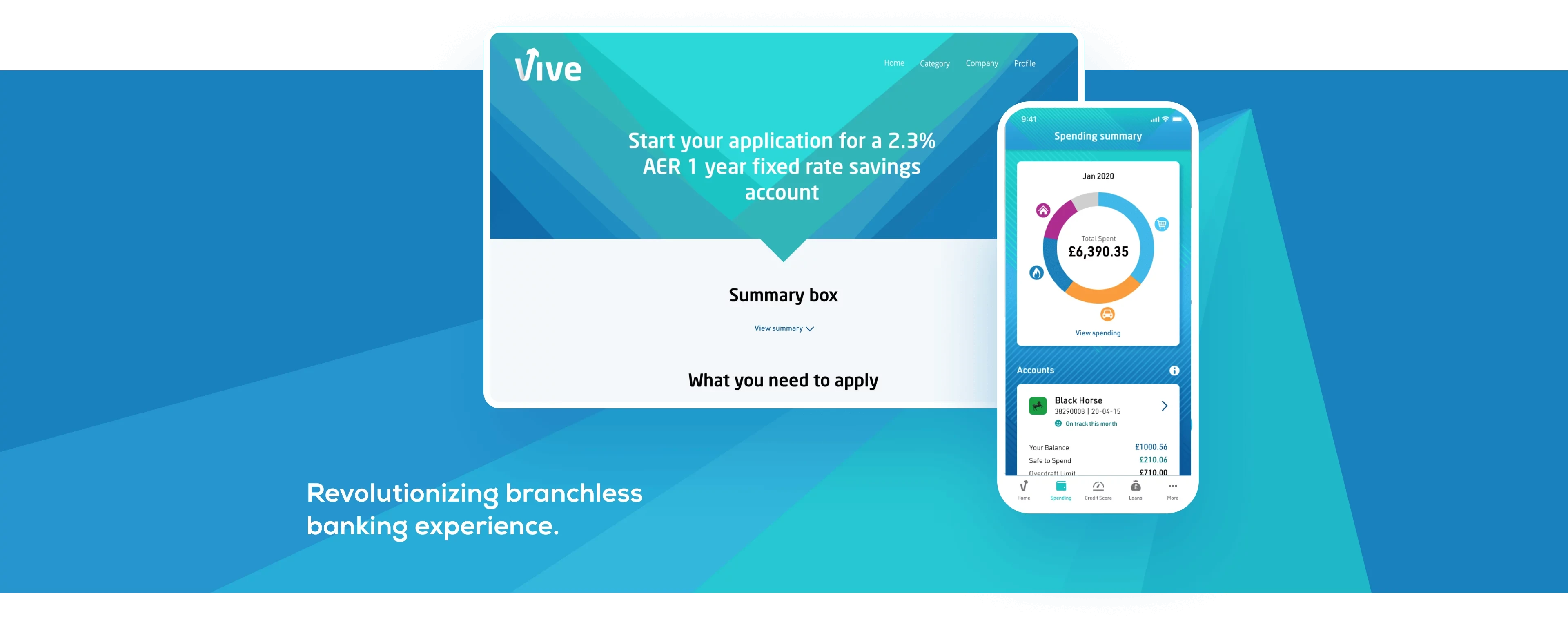
Vive
A new UK-based bank, committed to meeting the financial needs of underserved customers. No current accounts. No branches. No nasty surprises.
Overview
Vive is a digital bank that simplifies personal finance through innovative technology and fair products. Led by industry experts, our team has redesigned the Vive Banking mobile application to achieve this mission.
As part of a three-person design team, I focused on redesigning the homepage, spending screen, credit score, and informative notification cards of the app. My goal was to create a seamless and engaging user experience for our customers.
Challenges
Our team faced challenges during the redesign of the Vive Banking mobile app. The original design was made by a different agency, limiting our access to research and data. The app's visual language was outdated, so we modernized it to align with current design standards. We also developed the Credit Score screen from scratch, adding complexity to the project. But we worked tirelessly to deliver a modern, user-friendly design that met Vive's objectives and exceeded customer expectations.
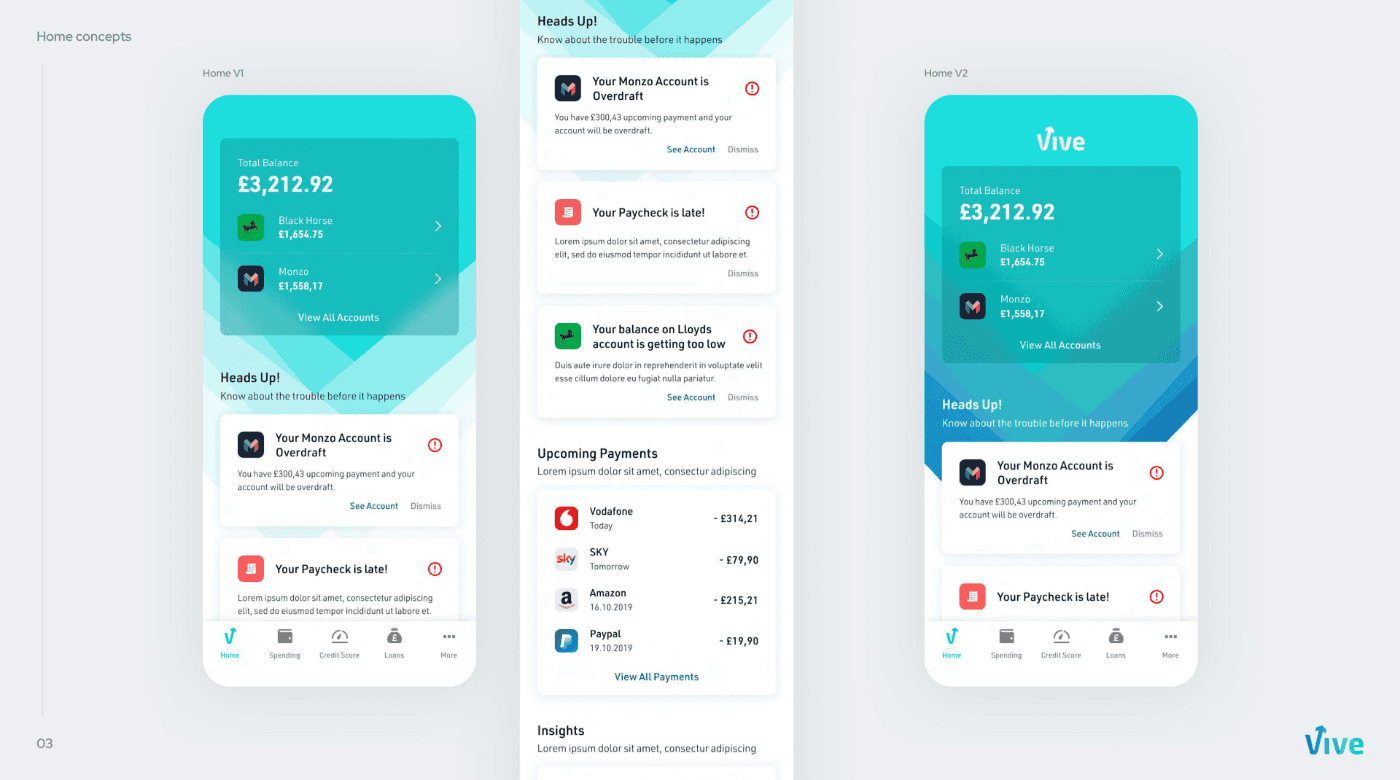
Homepage - Information at A Glance
To design our homepage, we conducted usability tests and interviews with real users. We wanted a design that was visually appealing and easy to use. Based on feedback, we made some improvements to the layout, such as adjusting the placement of elements and simplifying the design.
We created the homepage from scratch and included important information such as account balance and linked bank accounts. For users with multiple accounts, we showed the total balance and the top two active accounts. The challenge was balancing the client's branding with usability and aesthetics. They wanted the entire page on a colored background, but we knew it would affect focus and readability. So, we compromised with the background only at the top and added a card with a blurred background.
These changes helped us create a homepage that was both aesthetically pleasing and user-friendly.
Informative Cards - Get to Know Without Getting Nervous
One of the key design challenges we faced was designing information cards for Vive's users. These cards provided information about the user's financial movements, which is particularly important for a bank that serves users in poor economic conditions. We knew that most of our users were dealing with financial issues and might see mostly negative messages on the cards. To avoid overwhelming users, we had to present the information as entertaining but informative as possible.
In the first iteration, we used fun gifs related to the content on the info-cards. We thought that by using gifs, we could make the cards both fun and informative. However, after conducting small tests with users, we noticed that the gifs attracted attention initially but then caused users to lose focus. Although some users enjoyed the fun elements, the brand felt that the gifs were too playful for a financial application.
Taking this feedback into account, I decided to iterate on the design and explore other options. I realized that using emojis might be a more effective and familiar way to communicate the information. Using emojis would also help shorten the development process and reduce the application size.
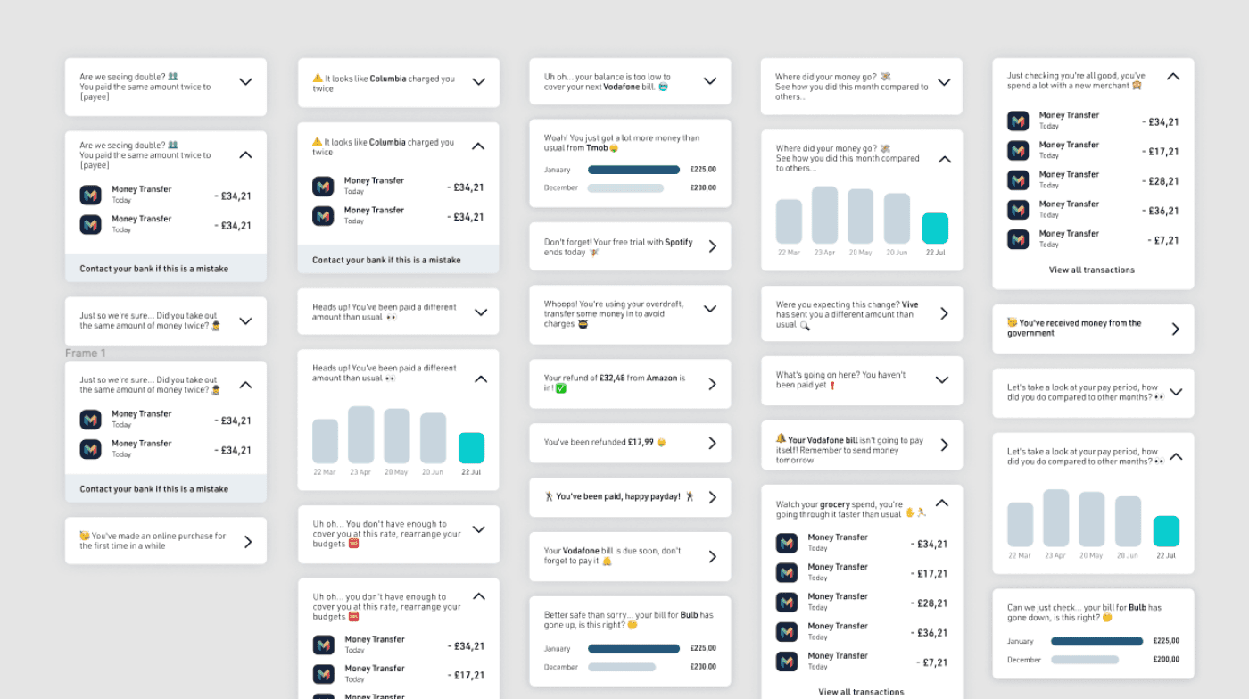
In the second iteration, I replaced the gifs with relevant emojis on the cards. The feedback we received from user testing was positive, and we found that users were able to focus better on the information. Although the emojis weren't as fun as the gifs, they helped users better understand their financial movements without overwhelming them. In conclusion, by iterating on the design, we were able to create information cards that were both informative and entertaining for Vive's users. The final design solution was not only visually appealing but also effective in communicating financial information in a more engaging way.
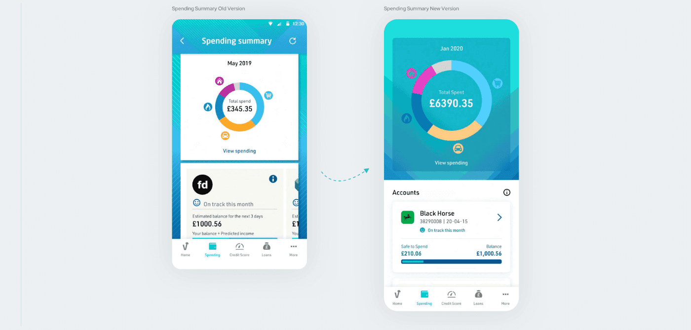
Spending Summary - Expect The Unexpected
The Spending Summary screen listed monthly expenses in categories on a pie chart and displayed payments based on bank accounts. However, the first version had several issues. The background was heavy and icons small. The carousel format was suboptimal and lacked a title.
I improved the screen by using a blurred background, larger icons, and a "pull to refresh" interaction. I added a heading for bank accounts, listed cards vertically, and included a graph for current balance and available credit. Lastly, I added account numbers for easy identification.
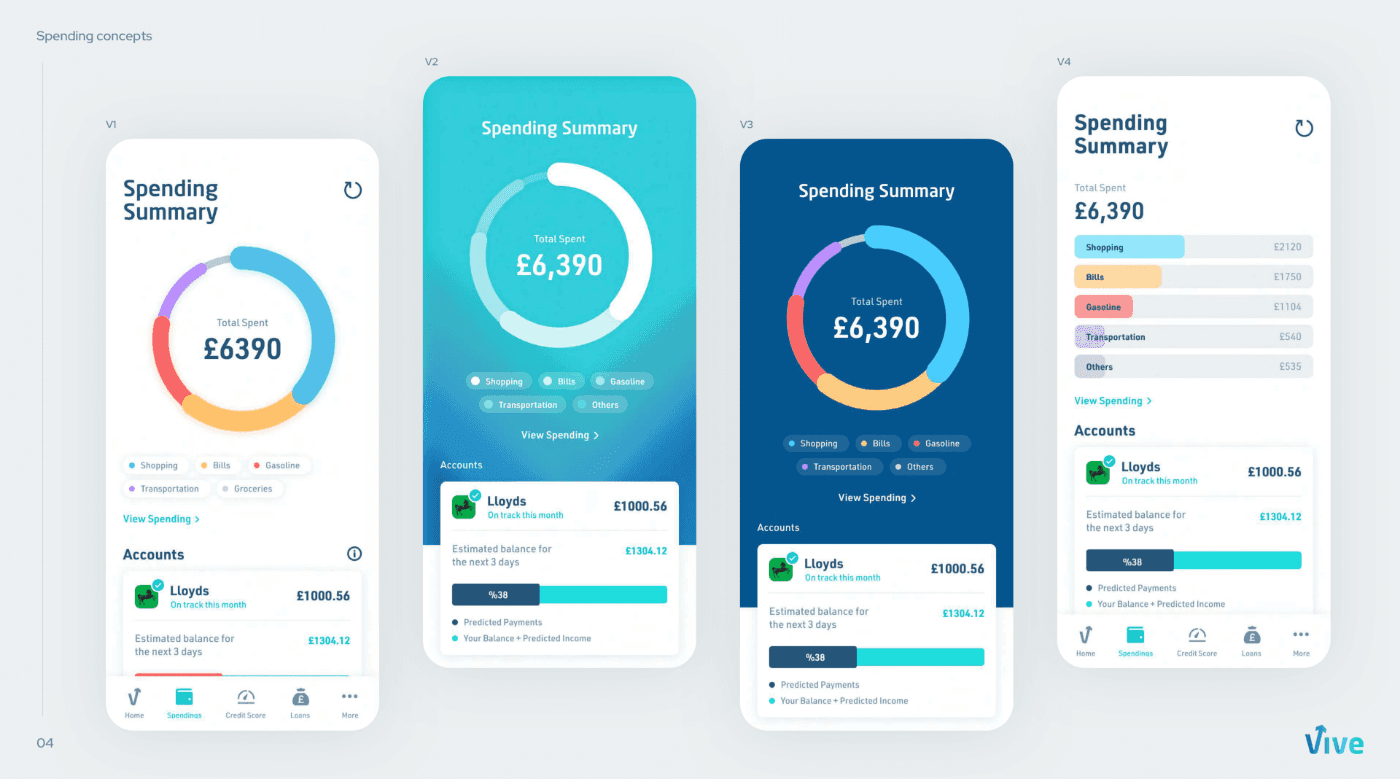
I iterated on alternatives to simplify the graphics section and improve user experience. While not all were used due to time constraints, the final design successfully addressed problems with the initial version.
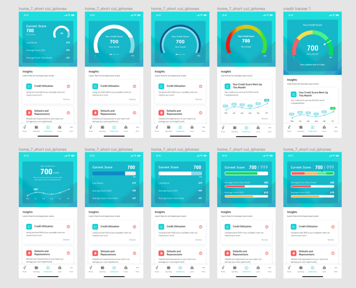
Credit Score Tracker - Financial literacy at a glimpse
I designed the Credit Tracker screen to help users keep an eye on their credit scores and get advice on how to improve them. I tried different ways to show the credit score clearly and attractively, and ended up using a bar chart to show how it changes over time.
The client wanted us to show changes in the credit score for the past few months. We tried using bar charts, but in the end, descriptive text worked better to give a clear and short summary of the information. We also offered suggestions to help users improve their credit scores based on their spending and financial history.
In short, the Credit Tracker screen is meant to make it easy for users to keep track of their finances and make smart decisions. By showing the information in a clear way and giving personalized advice, we hoped to give users the tools they need to take control of their finances.
Conclusion
Redesigning the Vive Banking mobile app was a real challenge, but definitely worth it! We put our skills and know-how to work to make a fresh, user-friendly design that didn't just meet Vive's goals, but exceeded customer expectations. We focused on the app's appearance and functionality, to ensure that using it was a breeze and actually fun. We made some clever tweaks to the homepage, spending summary, info cards, and credit score screens, to make managing your money easier with awesome tech, crystal-clear steps, and ethical products.
made with ❤️ in Amsterdam