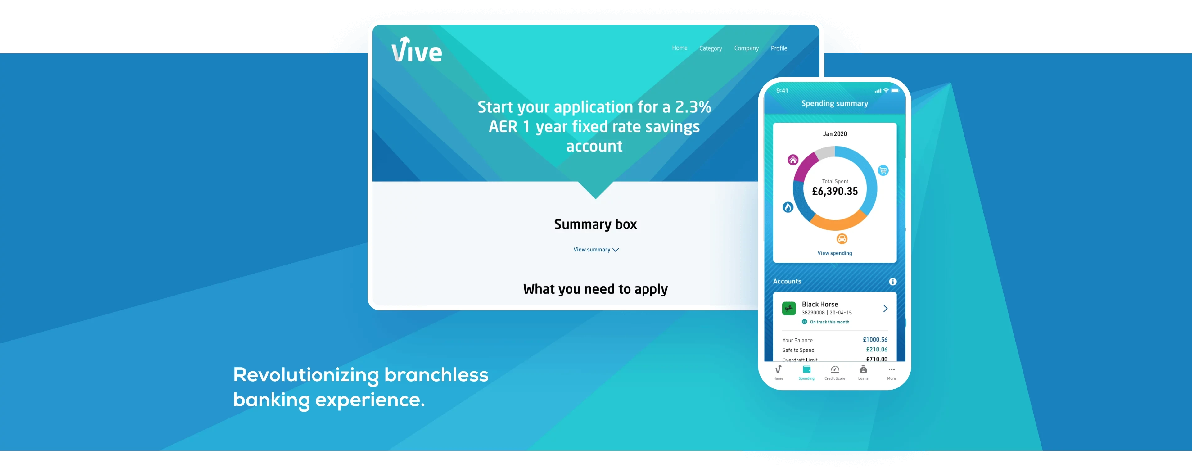
Vive
A new UK-based bank, committed to meeting the financial needs of underserved customers. No current accounts. No branches. No nasty surprises.
Overview
Vive is a branchless bank and has a team of industry experts with a proven track record of delivering market-leading banking products and services, who know that banking can be done better. Vive wants to simplify the world of personal finance, with fair products, clear processes, and innovative technology at the heart of everything they do. To accomplish this manifest, we re-designed the Vive Banking mobile application.
I was responsible for re-design of the Homepage, Spendings Screen, Credit Score, and informative notification cards on the Homepage of the app. We were 3 designers on the project. I mainly focused on Interaction and Visual Design of the project.
Challenges
The original design of the app has been completed by a different agency. For this reason, we had limited access to information related to research or data. The visual language was old and we had to renew it. Credit Score screen has been designed from scratch.
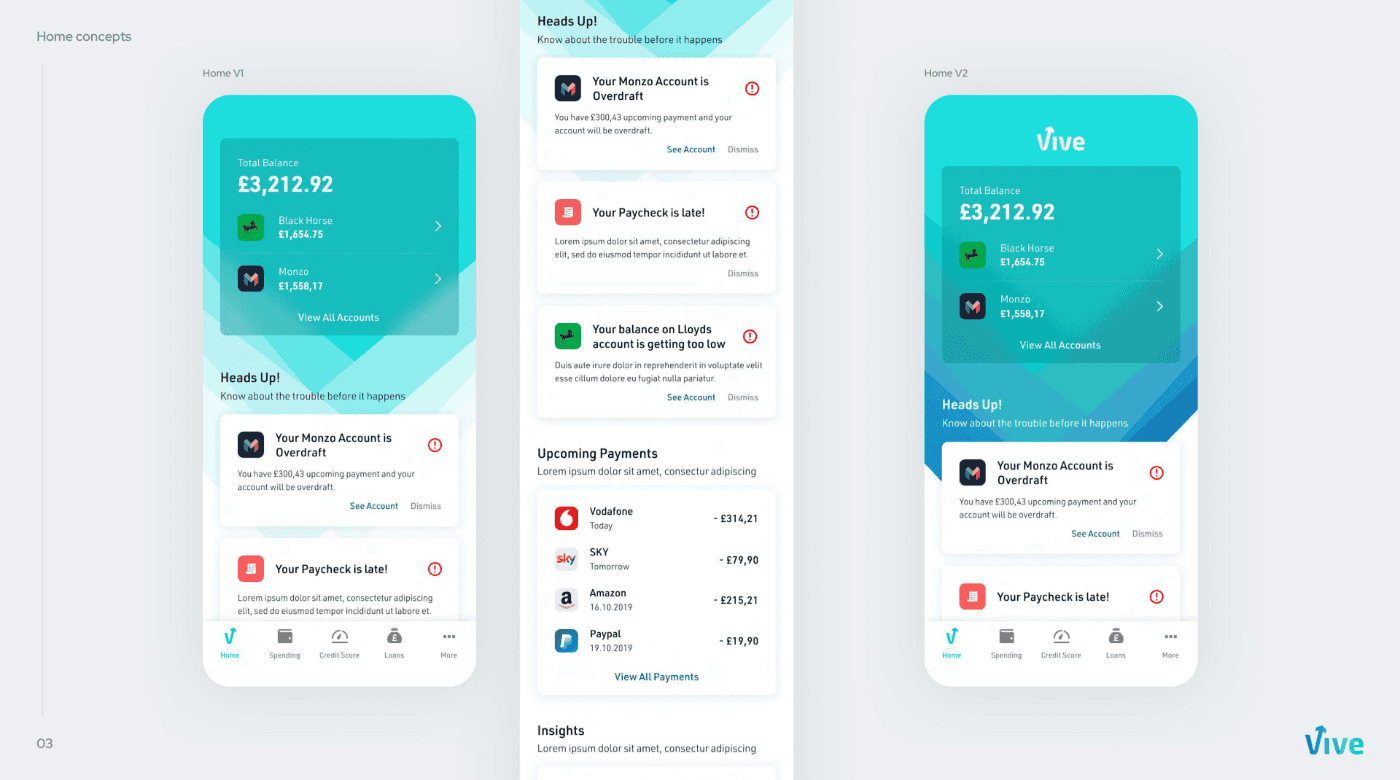
Homepage - Information at A Glance
Homepage, one of the most vital screens when we received the project, had not been designed yet. In about two weeks, we had to create a homepage from scratch. There were necessary pieces of information we had to give on the homepage. We had to highlight the account balance and the bank accounts aggregated to the application.
We have placed this information at the top of the screen to instantly show the money in their accounts when they launch the application.
Especially for users who view more than one bank account through the application, we decided to show the banks this balance came under the total account balance. When we looked at the user data in the Alpha test process, we saw that the users added an average of 2 bank accounts to this application. For this reason, we put the two most active bank accounts of the user directly in this area and placed a CTA to access other accounts.
One of the biggest problems we faced was that the brand wanted to prioritize branding as much as possible. The client wanted the entire page to sit on a colored background. However, this was not an aesthetically wise decision, and it also distracted the focus and reduced readability. Therefore, I decided to use the desired background only at the top of the page. To provide better contrast and recognizability, I used a card with a blur in the background. Thus, I have achieved a satisfactory result for both sides.
Informative Cards - Get to Know Without Getting Nervous
Apart from bank accounts, there were information messages we had to highlight. These messages provided information about the user’s financial movements. Since Vive is particularly a bank for users in poor economic conditions, we knew that most of our users were having financial issues. Therefore, we knew that users would see mostly negative messages. To avoid overwhelming users, we had to present these message cards as entertaining but informative as possible.
To do this, I first decided to use content-related fun gifs on info-cards. Thus, we would be able to provide related information while at the same time being as fun as possible.
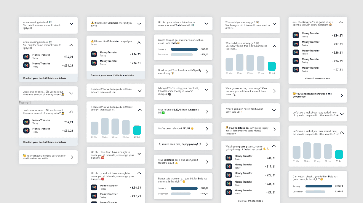
Second Iteration..
I admit that using gifs predominantly in a financial application was a bit of a bold move. In the small tests we conducted with users, we saw that gifs attracted attention at a glimpse but then caused them to move away from focus.
Although they liked the gif that the Queen waved at people very much, the brand also thought that gifs could be a little too fun. In the next step, because emojis are more known than gifs, I decided to use emojis. This change would also help shorten the development process and reduce the application size. Therefore, in our tests, we saw that although they are not as fun as gifs, emojis can create focus easier.
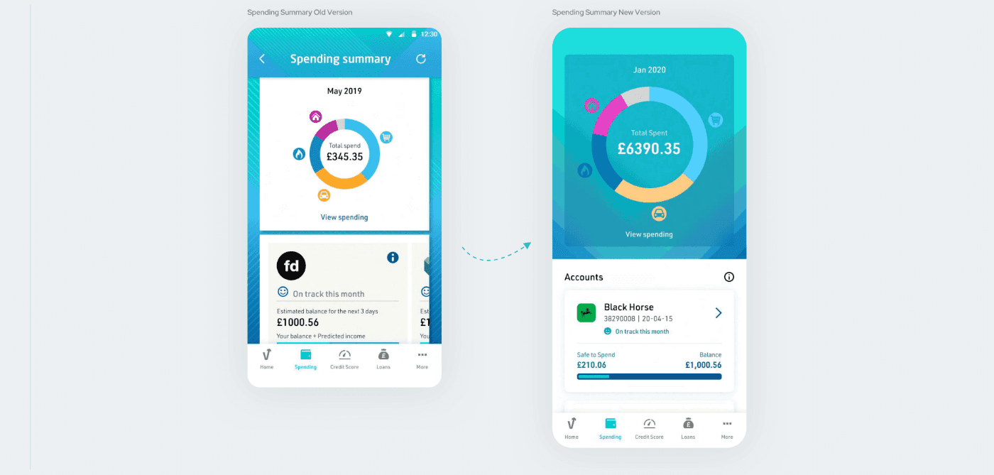
Spending Summary - Expect The Unexpected
Spending Summary was an essential screen. We needed to list users’ monthly expenses in individual categories on a pie chart. We also needed to show these payments under a separate transaction history based on a bank account. Therefore, we needed to display both the expense categories and the bank accounts on the page.
In the first version of the screen, there was heavy background usage. Also, the icons used for the categories were small and not accessible. Below the categories, the bank accounts listed in a carousel. Which, in my opinion, is not the right solution in this case.
The accounts section did not have a title. So it was hard to understand the purpose of the field. Although it provides the same information, the info icon is reused on every card. Due to the current design of the card, the planned expenses and current balance were not clear to understand.
Again, I used a blurred background to bring the categories in line with the new visual language. I increased the size of the icons to make them comfortable to touch. Instead of using a refresh icon, I decided to implement a known interaction “pull to refresh” to refresh the informations on the page. I also added a heading for the bank accounts section. I thought it would be better to list the account cards vertically instead of presenting them on a carousel.
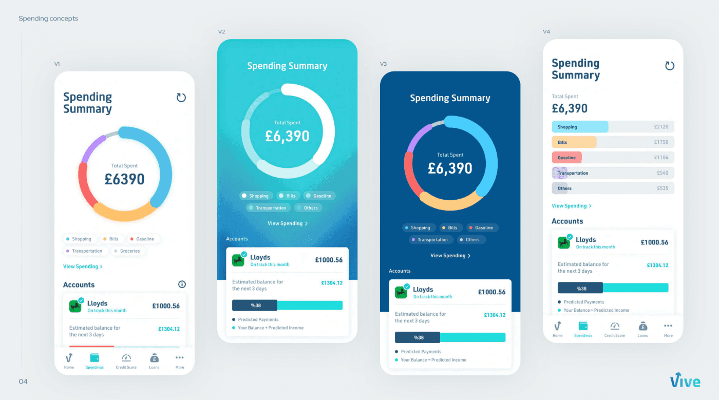
More alternatives
Although our time was limited, I have created several versions to see more alternatives together. Each of these versions was designed to present the existing features in a cleaner and straightforward way. Especially, I tried to simplify the graphics section with a clean background and lazy tags for each categories.
** But due to time constraints, we were unable to implement any of them.
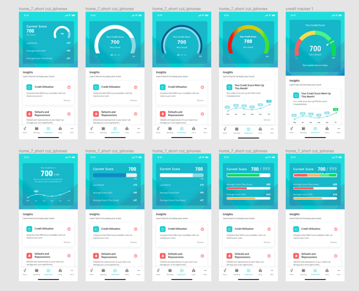
Credit Score Tracker - Financial literacy at a glimpse
The last part I contributed to was the Credit Tracker screen. This screen aims to allow users to easily track their credit scores and increase them with suggestions.
When designing the credit score page, I tried to produce quite different variations. Although the design of the suggestion cards is relatively simple, it took quite a bit of time to display the score in a clear graphic.
We tried line charts and pie charts to present the information clearly. But none of these methods produced the desired effect. Then I decided to use a bar chart because I thought that the credit score shows a linear increase or decrease.
At this point, the client asked us to show the changes in credit score over the past few months. Although we tried to show this with bar charts, I decided to use descriptive text because I thought it would be much more confusing at the end of the day.
Conclusion
The last part I contributed to was the Credit Tracker screen. This screen aims to allow users to easily track their credit scores and increase them with suggestions.
When designing the credit score page, I tried to produce quite different variations. Although the design of the suggestion cards is relatively simple, it took quite a bit of time to display the score in a clear graphic.
made with ❤️ in Amsterdam